
Over at Buzzfeed, John Herman notes that the introduction of new retina displays for the iPad is giving mobile app designers pause about a previously overlooked design element: fonts. He points to the app Readability’s licensing of fonts from Hoefler & Frere-Jones, one of the most establish foundries (yes, this is what they are called) in the business. Marco Arment, creator of the popular Instapaper alluded to the difficulties of finding good fonts on Twitter:
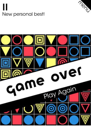
Games absolutely suffer from poor type as well. For all of their mechanical sophistication, I feel uninspired by what typically feels like cartoony or childish arrangements. We need more games like Bauhaus Break, one of my recent favorites, to push games towards uniqueness. Are there any other examples we should be paying attention to?
[via Buzzfeed]


