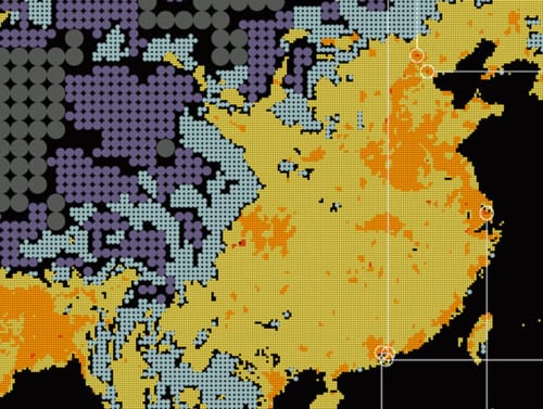
The data visualization firm Fantom have managed to turn the dull (well, at least to most) topic of population density into a visually interesting map. Continents are made up of dots corresponding to population density. The eastern seaboard is filled with tiny bright balls each representing a dense population center, while the Sahara desert is made up of large circles giving a sense of just how far apart people are.
This reversed graphic language makes Fathom’s map visually rich—the information-carrying graphic elements fill up the entire map, instead of clustering in pockets surrounded by neutral negative space. But it’s also narratively richer, as well. Glancing at the entire map at once tells a different story than peering closely at one of those densely packed yellow and orange clusters.
It really shows how representing space different tells different stories. A dense space is visually more interesting than a large monotonous open space. The poster’s combination of the two, however, creates a story from the incongruity.
– Filipe Salgado


